Building a unified, accessible design system for wetter.com — one of Germany's leading weather platforms — from Sketch chaos to shared tokens living in both design and code.

wetter.com is one of the main weather providers in Germany, also serving the wider European market and the US. Its ecosystem spans a large content-rich website (editorial articles, video, sponsored pages), two native mobile apps, and a complex weather-radar product with its own team.
When I joined, there was no interface designer and no shared design language. I took this on as a self-driven initiative — it was never a quarterly KPI, but it was badly needed — and turned scattered, product-by-product design into a single system adopted across every surface.
Design lived in Sketch, split into small per-product libraries with outdated elements — and no consistency between the website and even the two mobile apps.
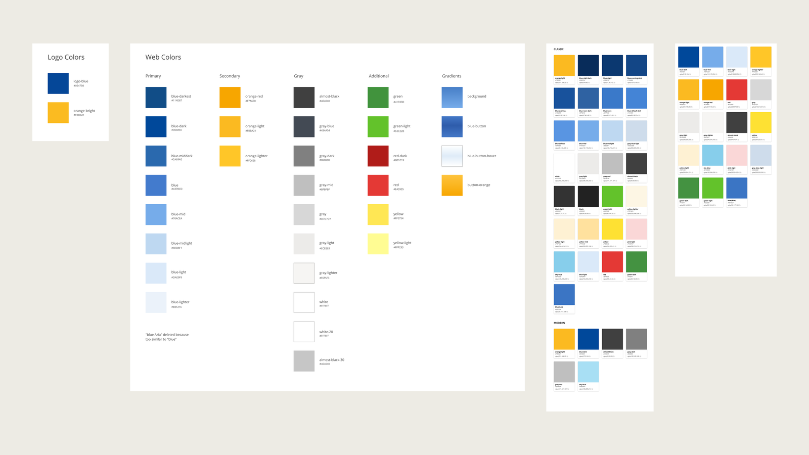
The most telling symptom: colors that looked alike but carried different hex codes across products — iOS and Android didn't even match. Handoff relied on an extra cloud plugin because Sketch wasn't cloud-native at the time.
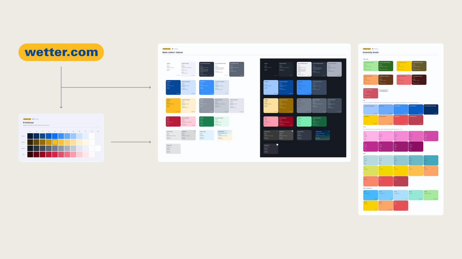
I anchored everything to the two brand colors — the logo's blue and yellow — and expanded them into shades using lightness grades (HSL). I based the approach on Material Design 3, prioritizing Android (our largest user base) and its color-generation model, then simplified and adapted it to our needs: fewer background and text roles than M3 proposes, corrected for contrast, and keeping brand blue and yellow exact. Everything moved into dedicated Figma design-system files with documented tokens, handed to developers as JSON — including how each token should be named in code, so design and code stayed in lockstep.


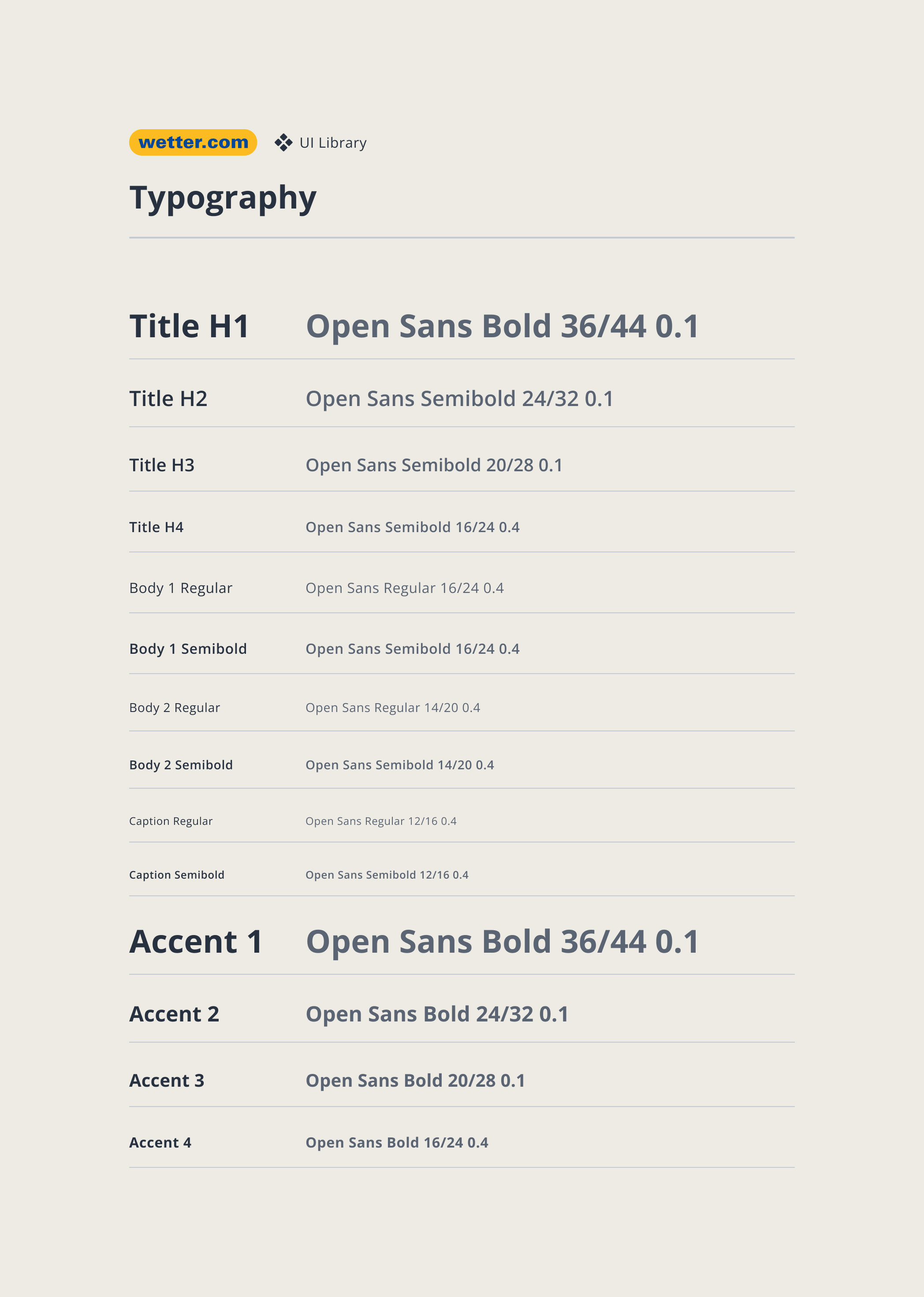
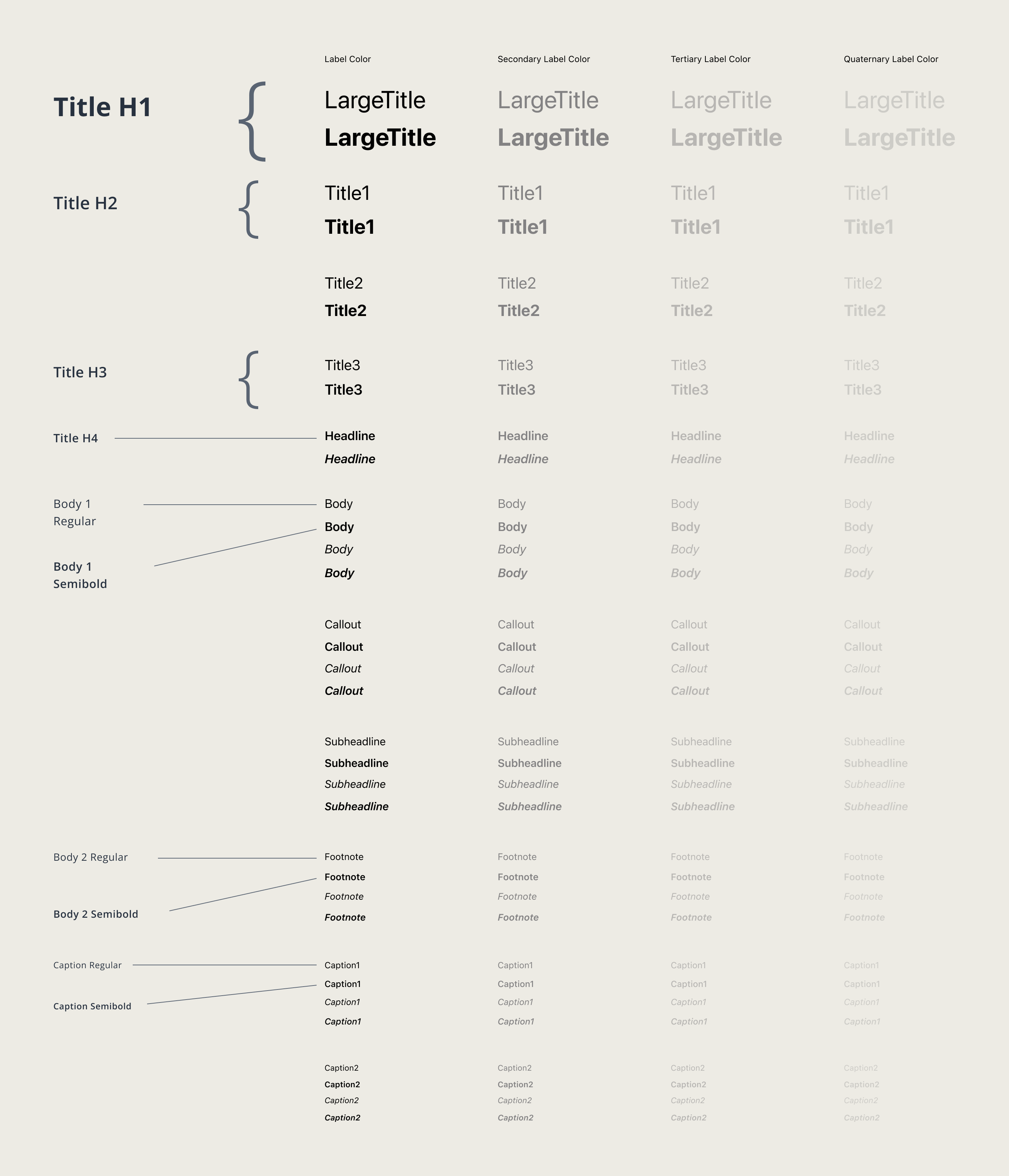
For years the same typeface ran on three near-identical scales — iOS, Android and web — with sizes drifting by about a pixel between them. I unified them into one universal set of text styles: no re-sizing a mockup when it moves between platforms, faster design and more consistent products. It stays accessible — each style is bound to the platform's native Dynamic Type curve, so system font-scaling still works, including iOS's non-linear curve where large titles grow more slowly than body text (Android scales proportionally, in its own units, which the tokens handle). Now rolling out with engineering.


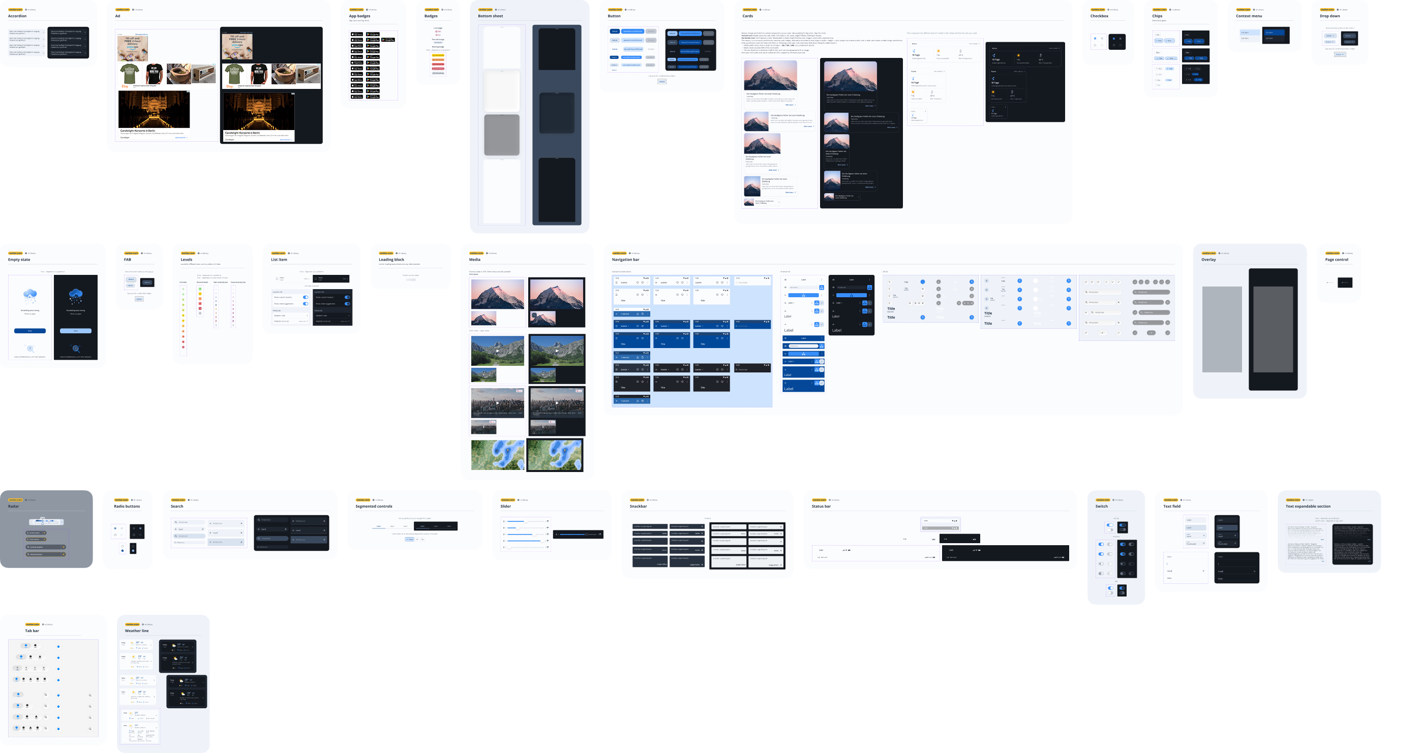
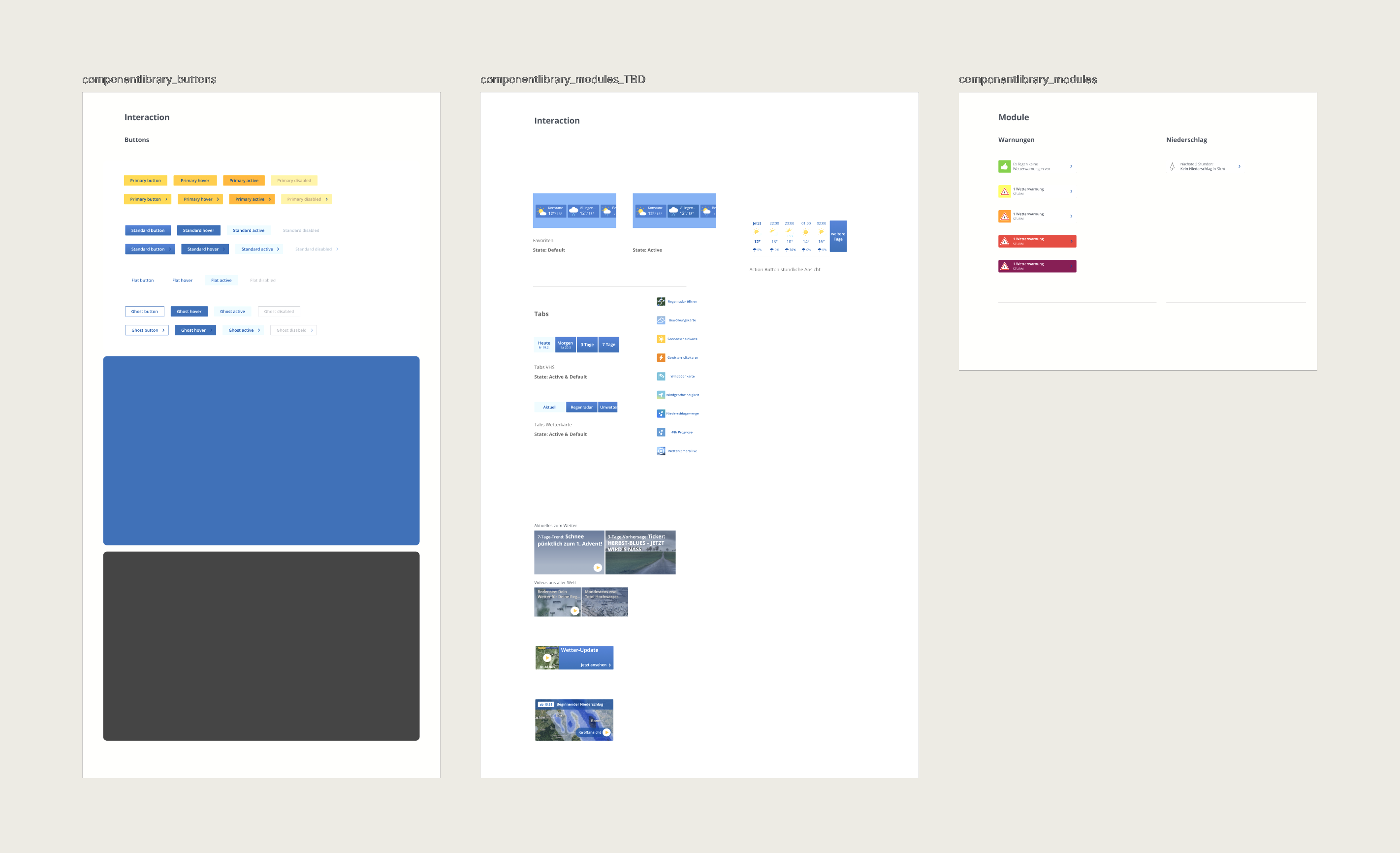
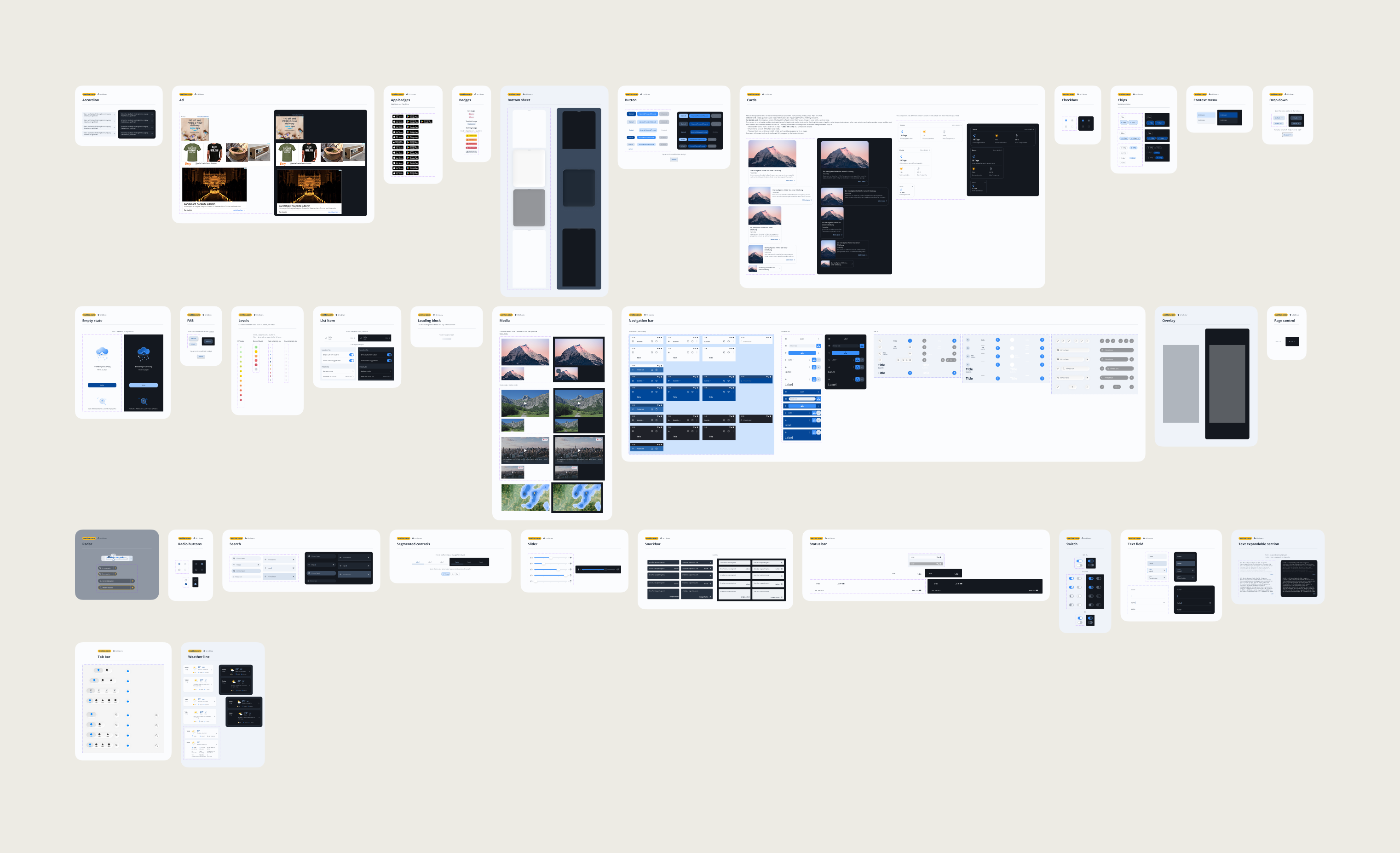
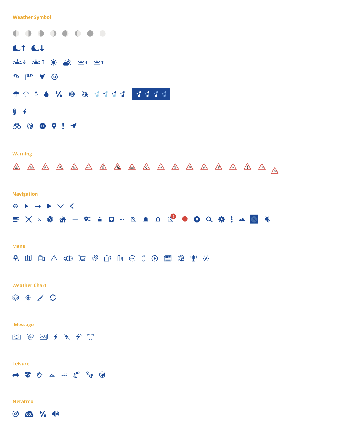
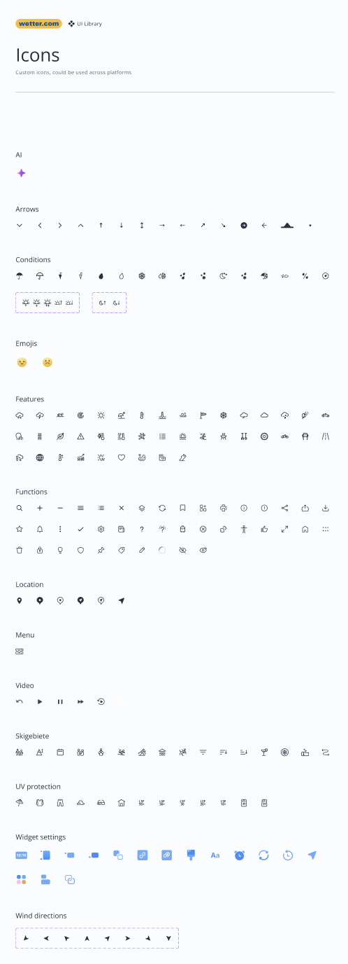
Nearly every icon was drawn by hand to give the products an authored, copyright-clean style. On top of that I built a library of reusable components — buttons with every state and size, input fields, and more — designed to be reused not just within one product on one platform, but across platforms.


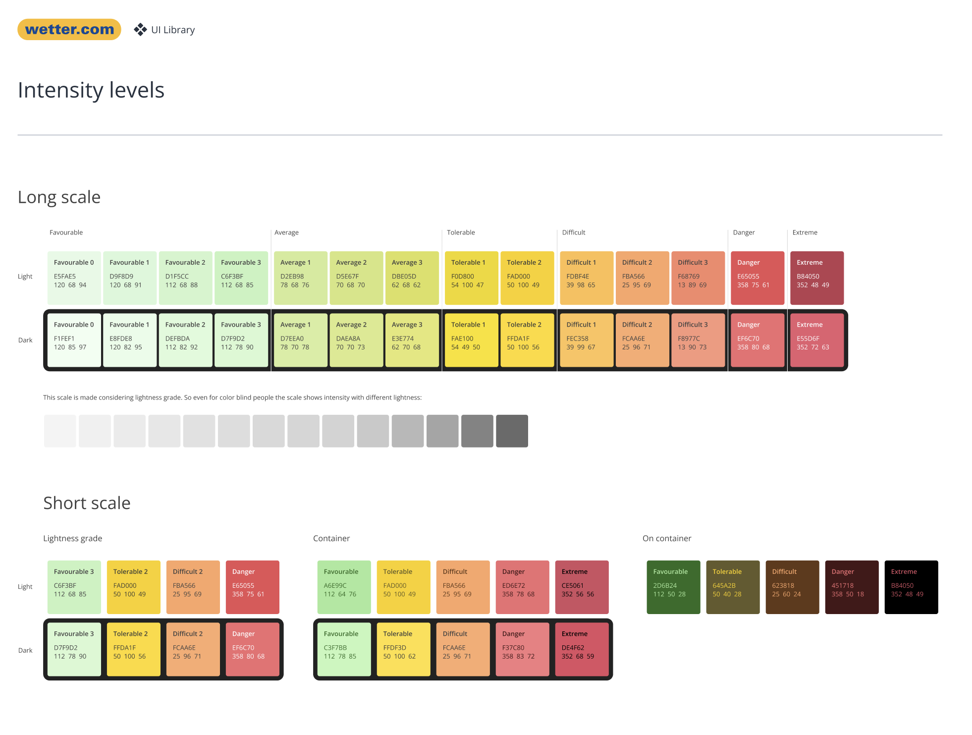
A weather product lives on scales — precipitation, temperature, warnings, pollen. The old ones used garish, clashing colors (acid green, alarm red) that fought each other. I designed a harmonious range from green to deep red that stays legible and calm, with distinct variants for backgrounds vs. text on top, plus long and short scales depending on how many levels a situation needs.
A simple traffic-light logic — green, yellow, orange, red — so meaning is read instantly, no legend required. I avoided unintuitive schemes (blue or purple after red) that force people to decode a key.
Color always pairs with text or the value itself (°C, level). Ambiguity is a UX failure in a product people rely on for safety-critical readings.
For precipitation I encode intensity through lightness of blue — lighter = weaker, darker = stronger — so it still reads in greyscale or with color-vision deficiency.
Text is held to AA-level contrast (4.5:1+). Icons never appear without a label unless truly universal (close, search, back).
Every step is built on a lightness grade — so even in greyscale, or for color-blind users, intensity still reads. Light & dark variants, plus container / on-container / on-surface tokens for text legibility.

From four drifting products to one system — living in design and in code.