Redesigning wetter.com's pollen forecast — and building it from scratch in the mobile apps — so allergy sufferers can read a dense, 41-type, seven-day forecast at a glance and pin the types that matter to them.

The pollen forecast covers around 41 pollen types, each with a seven-day outlook at four levels — 0 none, 1 low, 2 elevated, 3 high. On the website it needed a redesign; in the mobile apps the section didn't exist at all, so I created it.
I don't have a pollen allergy myself, so I started where it mattered most — by learning from the people who live with one. That research shaped every decision that followed: how to show a lot of data simply, how to let people focus on the few types that affect them, and how to keep it accessible.
A lot of data on a small screen — 41 pollen types × 7 days × 4 levels — for people who only care about a few types, but still need everything within reach.
Allergy sufferers track the specific types that affect them, yet nothing can be hidden — the full picture has to stay available and findable. And levels can't be communicated by colour alone.
Since I don't have the allergy myself, I ran a broad study with people who do — across ages and severity, from mild seasonal sniffles to reactions that genuinely shape someone's day. Open, experience-based conversations about how they cope today: which app or site they check, what they trust, where it lets them down, and the small decisions pollen drives — whether to open a window, hang the laundry, take medication before heading out, or pick a different route.
Two findings shaped everything. First, people actively track only a few specific types that affect them — but they still want every type available and searchable, so nothing feels hidden. Second, charts split people roughly in half: some read a graph easily and even enjoy it, others find it off-putting and disengage — and you can't tell which kind someone is in advance. That ruled out a chart-first design and pointed to something everyone can read at a glance, paired with the ability to save the handful of types that matter to you.
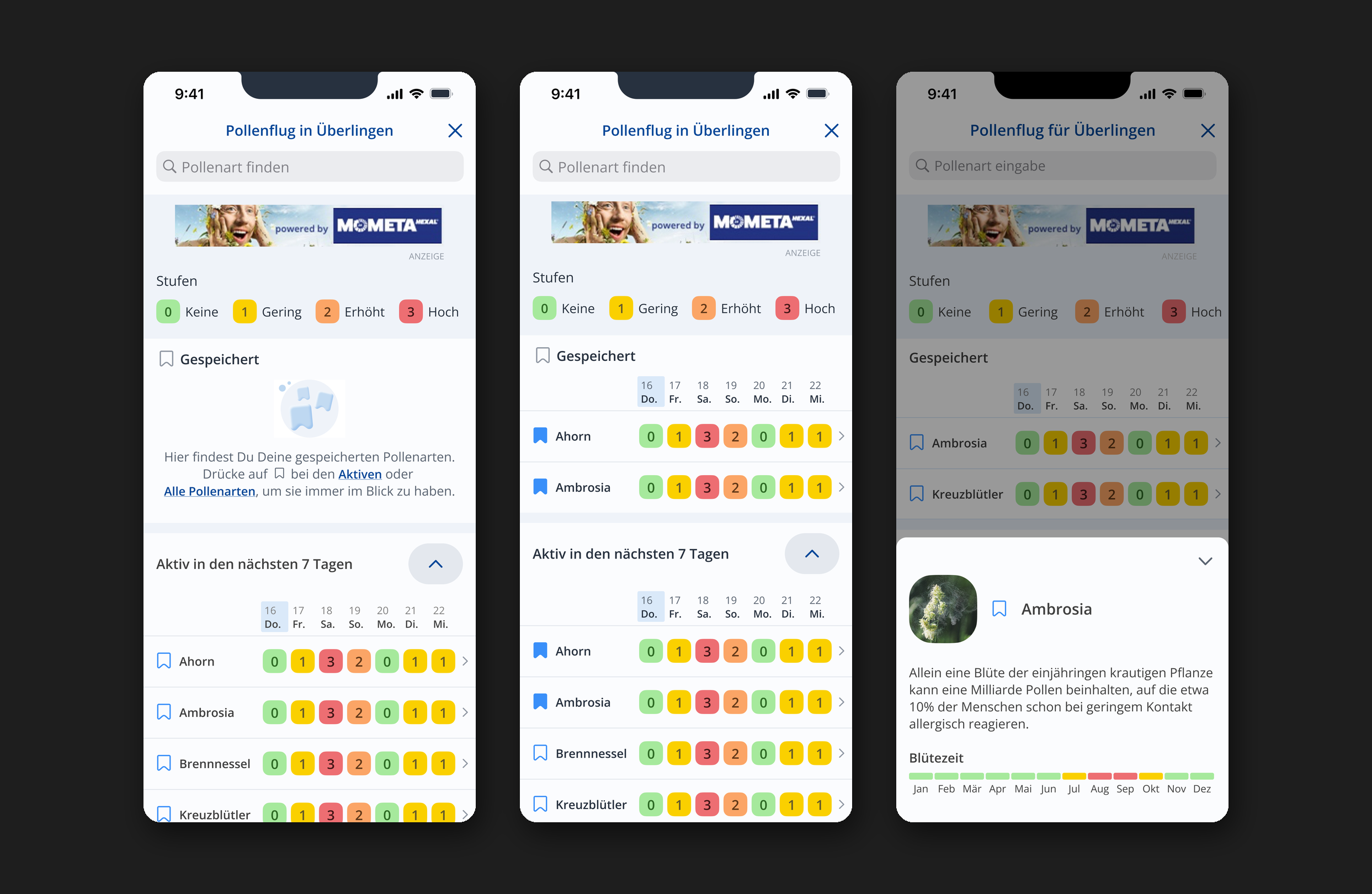
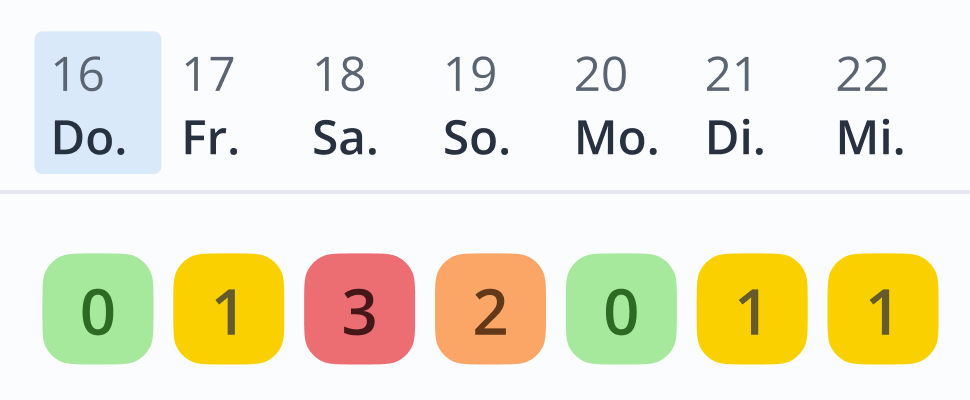
Instead of a graph, each day's level is a coloured square with the number inside, next to an always-visible legend. Colour, number and position together mean it reads instantly — nothing to decode — and it tested as effortless for nearly every participant. It's accessible by default (never colour alone) and built on the level colour scale from the design system. I tested several screen variants across rounds of research before landing on this one.

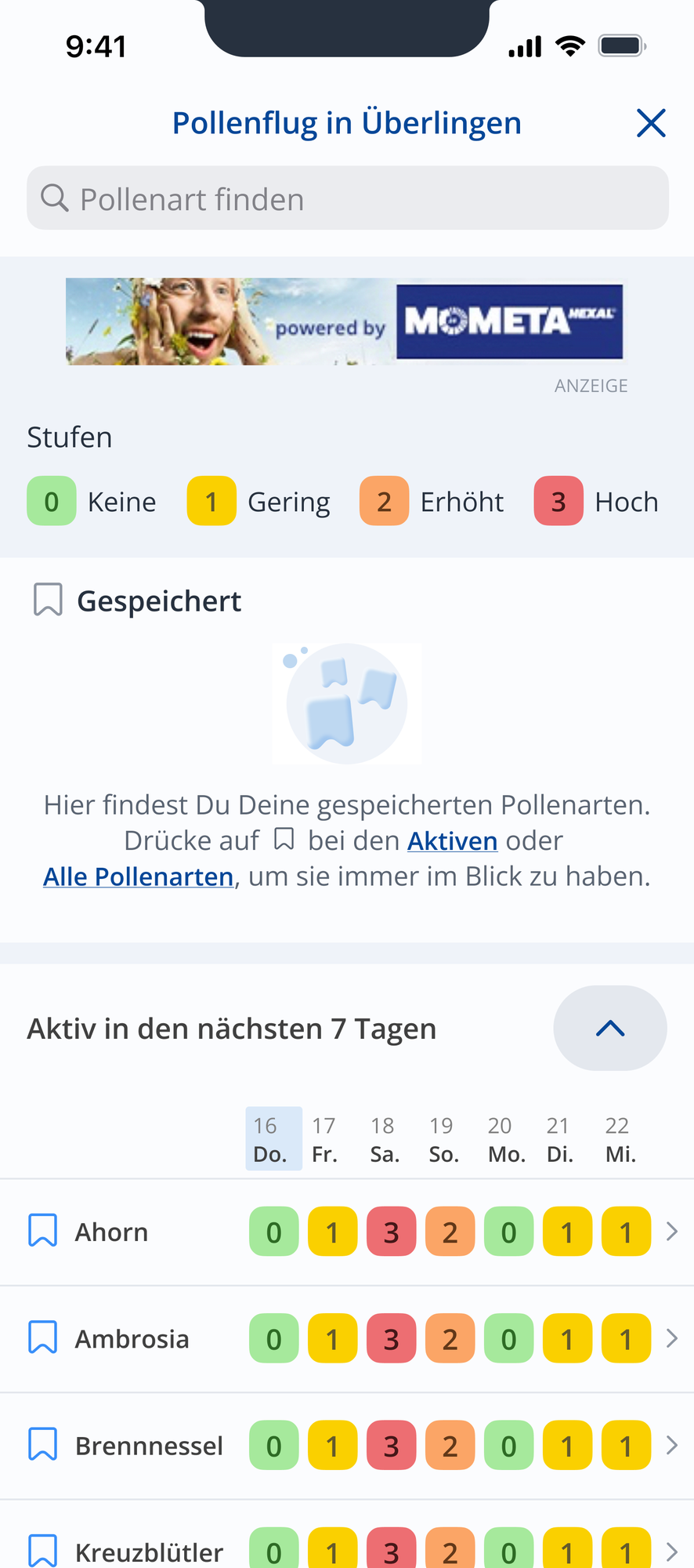
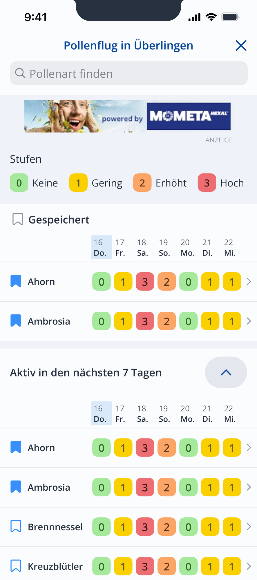
A bookmark mechanic — shaped together with product and colleagues who have allergies — lets people save the types that affect them. A Saved block is pinned at the very top: the first thing you see, which also teaches the save feature. Below it, Active in the next 7 days shows only what's relevant now, not all 41. And All types is a collapsible list that intentionally repeats the others — so no one ever gets lost, and saved types stay flagged. A search bar jumps to a specific type, sticky headers keep the list name and weekdays in view as you scroll (and in search results), and tapping a type opens a bottom sheet with its description.


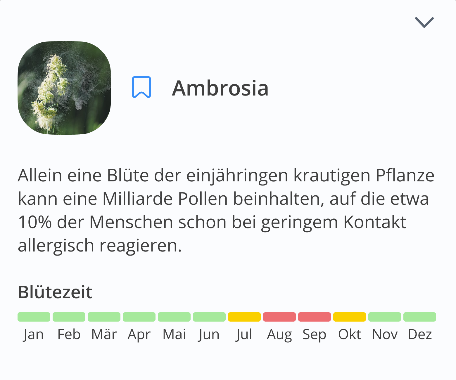
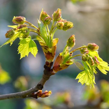
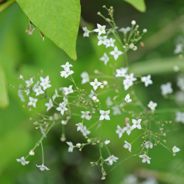
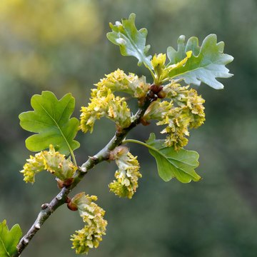
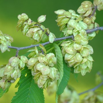
On the app home, a pollen reminder flags when a saved type is running high — so people stay ahead of a bad day even without opening the section. And to help people recognise what actually triggers them, we produced realistic AI-generated images of each plant, one per pollen type.


Researching how people read graphs surfaced something I didn't expect: they split almost 50/50. Half read charts comfortably and even enjoy them; the other half find them off-putting — and you can't predict who is who. So I designed one format that works for everyone: a coloured square with the level number inside, and a legend that's always on screen.
Coloured squares with a number and a fixed legend — no axes to parse — tested as clear to nearly all respondents.
Level is carried by colour, number and a persistent legend — accessible by default, including for colour-vision deficiency.
Saved and active lists surface what matters, while all 41 types stay one search away.
Pinning Saved at the top both serves the core task and teaches people they can personalise the view.
A dense, 41-type forecast that now reads at a glance — with the types that matter pinned on top.
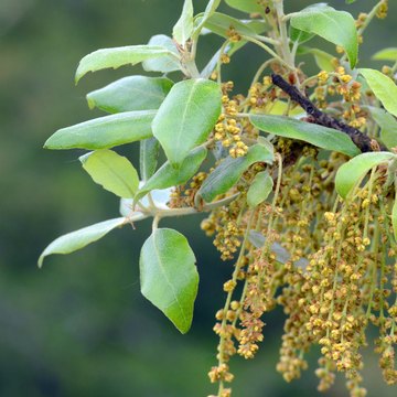

Research-led and shaped with product — including colleagues who have pollen allergies and now use it daily. They, and users, find the section genuinely convenient. Realistic per-plant imagery was AI-generated to aid recognition.