Project · Product & Interaction Design

Making a real-time
precipitation radar readable

Redesigning wetter.com's rain & snow radar — a dense, real-time, interactive map — so anyone can read where precipitation is, how intense it is, and where it's heading, without a legend or a second thought.

Client
wetter.com
Role
Senior UX/UI Designer
Platforms
Web · iOS · Android
Coverage
Europe & USA
Scope
UX research · Data-viz · Accessibility · Interaction
Real-time data Data visualization Accessibility · WCAG Interaction design Map UX
Before
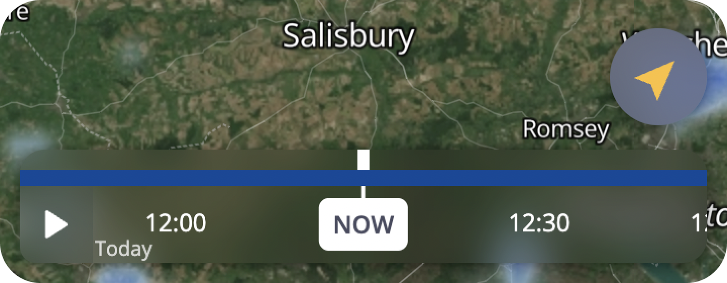
Old rain radar — busy satellite map, cramped tooltip and a thin timeline scrubber
After
Redesigned precipitation radar — calmer map, translucent controls, a readable bar-chart timeline
01

Overview

The radar is a precipitation map: it shows where rain and snow will fall over the next one to two days, and at what intensity, across Europe and the USA. It's real-time and highly interactive — you can pan and zoom the map, press play to watch precipitation move, and scrub a timeline backward and forward.

It already lived on web, iOS and Android when I joined. But UX research surfaced serious usability and accessibility problems: the product was packed with live data, yet what that data actually meant was hard to read. My job was to make a genuinely data-heavy, animated product feel effortless — precise where it needs to be, and honest about what it shows.

02

The problem

Two layers both encoded intensity by color — the map, and a timeline sitting on a transparent background — so their colors merged and the whole thing became hard to parse.

Worse, the same intensity often appeared as different colors on the map and on the timeline. Both used smooth gradients between data points, so the in-between colors didn't line up — and inconsistency like that quietly erodes trust in a weather product people rely on.

There was also a structural challenge under the hood: the first ~2 hours are real 5-minute station data; after that it's an hourly forecast from a different model. The seam between them left a gap the old design covered with a jarring grey "switching to hourly forecast" screen.

What research surfaced
  • Not accessible — intensity was communicated by color alone.
  • Map & timeline merged — transparent timeline, colors blending into the map.
  • Color mismatch — same intensity, different color on map vs timeline.
  • Rain looked like cloud — soft, gradient edges read as cloud, not precipitation.
  • Hidden scroll — users didn't realize the timeline scrolled for more time.
  • Vague tooltip — a callout said only "weak / strong", with no context.
  • No day indicator — impossible to tell today from tomorrow.
  • Cramped map — toolbars, search, ad, legend and timeline crowded out the map users love most.
03

Process & decisions

3.1

A timeline you can actually read — a bar chart

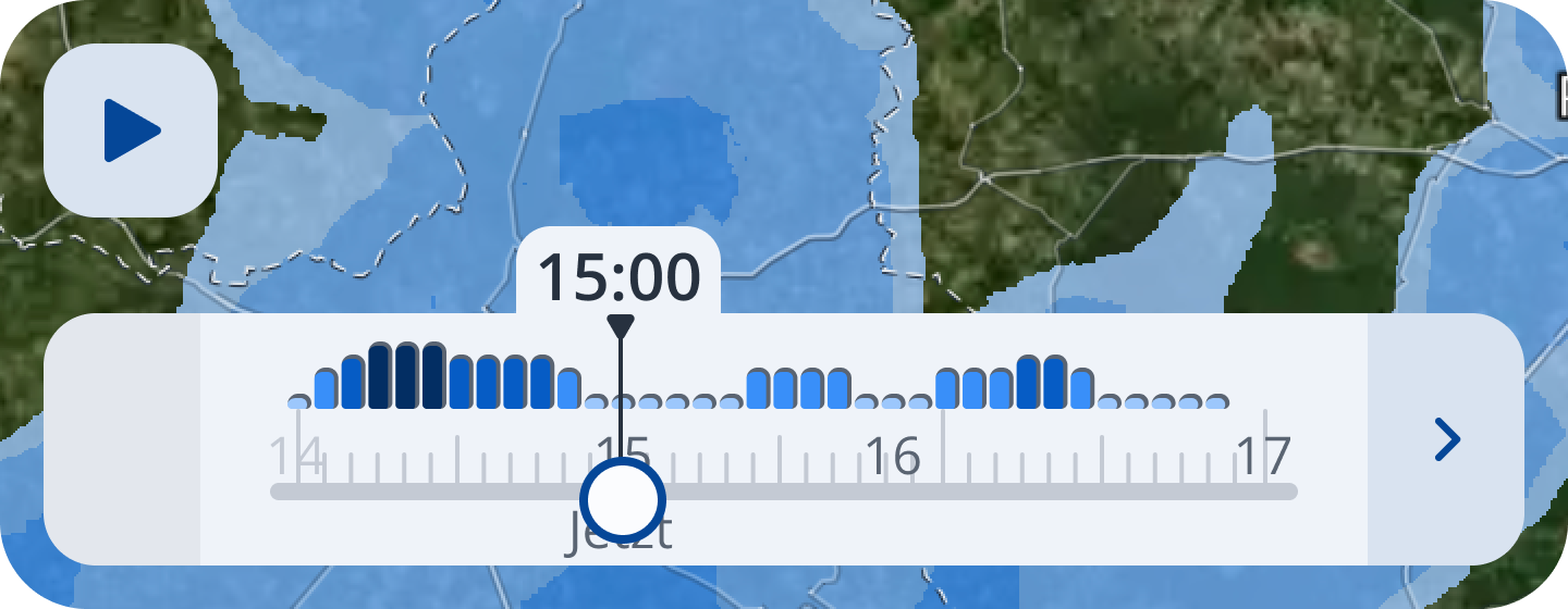
I replaced the horizontal gradient strip with a bar chart: one bar per 5-minute step (then per hour), each filled to a height and a color. Now intensity reads two ways — color and height — so it no longer depends on color alone, which is essential for accessibility. I chose bars deliberately: research on chart comprehension shows most non-technical people struggle to read graphs, but simple bars with no axes tested as understandable to almost everyone — predictable, low cognitive load, no explanation required.

BeforeThin line · merged with the map
Old radar timeline — a thin blue line on a transparent background blending into the map
AfterBar chart · color + height
New radar timeline — a bar chart encoding precipitation intensity by both color and bar height
3.2

Show the truth, not a guess

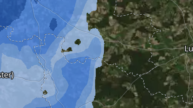
I removed the gradients. Precipitation now renders as sharp-edged blocks — one intensity ends with a clean edge, the next begins. That fixed three things at once: it stops looking like cloud, you can read the exact intensity for a precise spot on the map, and the map and timeline finally agree, because both show only the real data points we trust rather than invented in-between colors. When we're only sure of the data at each interval, showing a smooth gradient between them isn't honest — so I cut it.

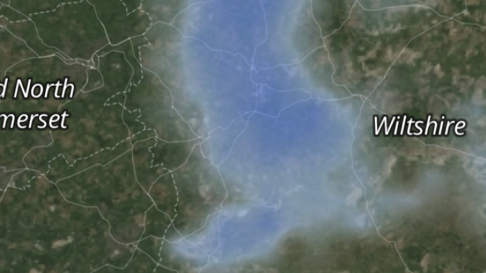
BeforeSoft gradient blobs (read as cloud)
Old radar map rendering — soft, blurred precipitation blobs over the satellite base
AfterSharp, honest intensity blocks
New radar map rendering — crisp, well-defined precipitation with clear edges
3.3

Give the map room — accessible color & tooltip

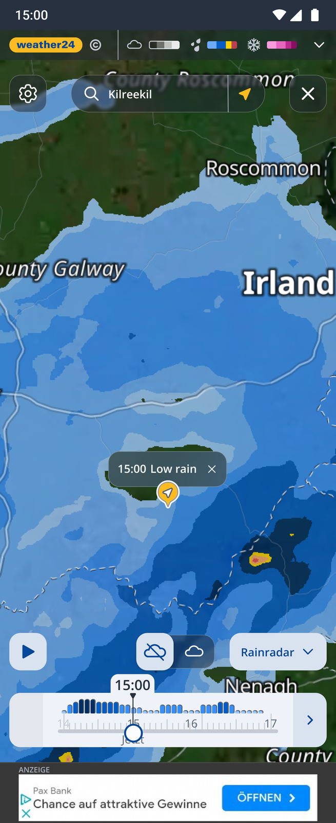
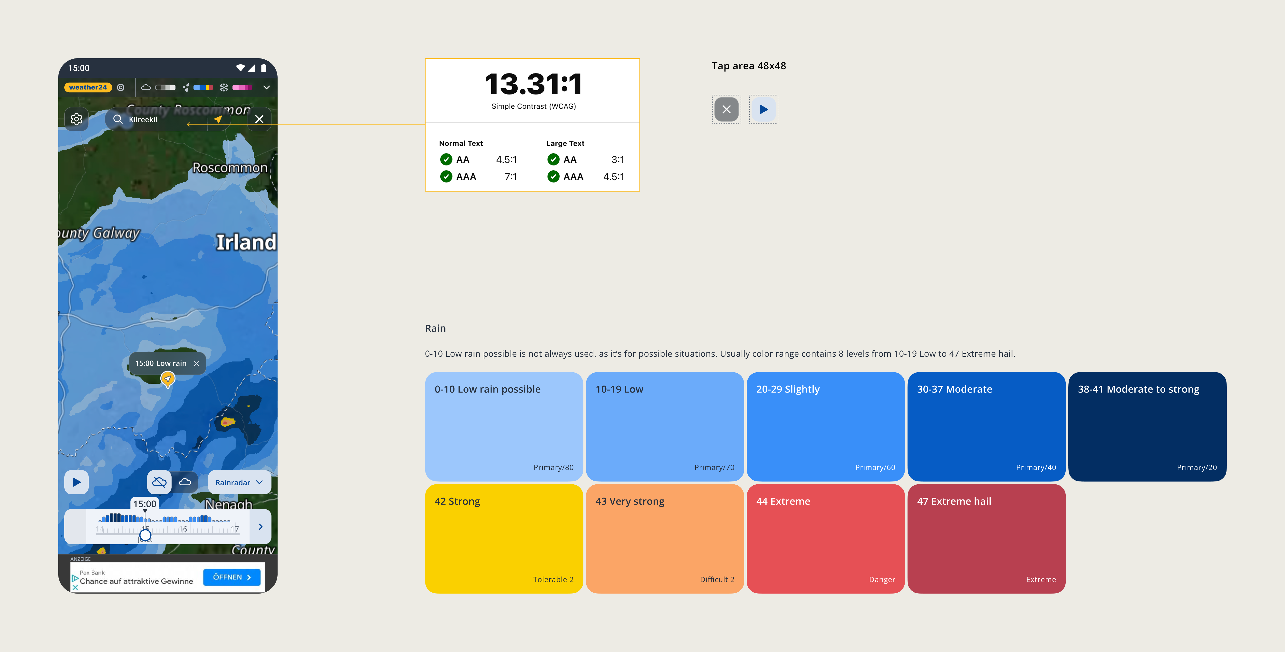
Research showed the map is what people love most — they zoom, pan, and hit play to watch precipitation move — so I gave it the whole screen. With another designer we floated the controls on translucent-but-accessible surfaces (contrast and tap targets preserved), opened the radar as a full-screen overlay with a close (×) instead of a heavy app bar, moved the legend, and added playback speed, a return-to-now control and map refresh. I also swapped the old pale blues (too easily read as cloud) for a ramp from our design system — light-to-dark blue for rain and snow intensity, escalating to yellow–red when precipitation turns dangerous — always paired with bar height and a plain-language label. The map tooltip now points to a precise location with a time and a readable intensity word.

Redesigned radar full-screen — translucent accessible controls, location tooltip, WCAG 13.31:1 contrast check, 48x48 tap targets and the calibrated rain colour scale from Low to Extreme hail
3.4

One place to switch maps

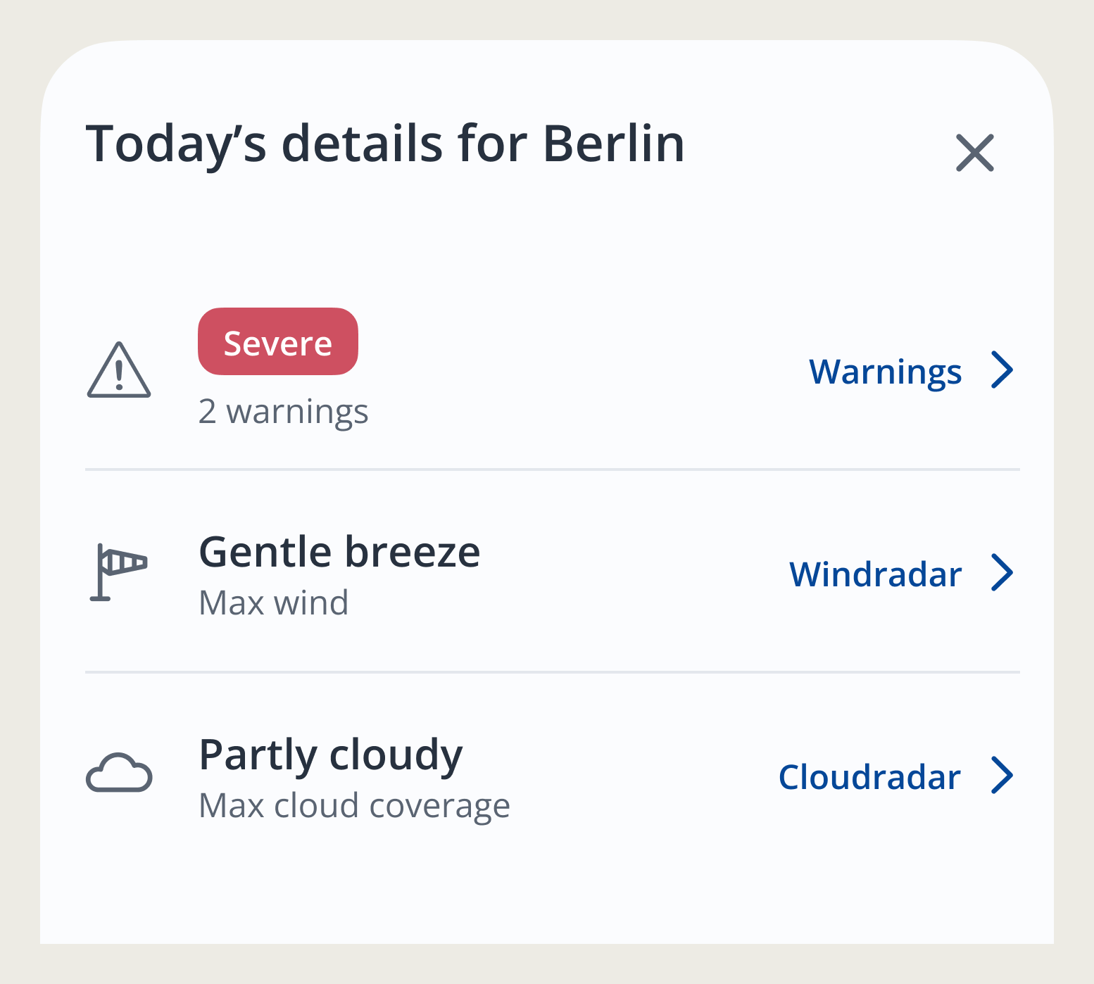
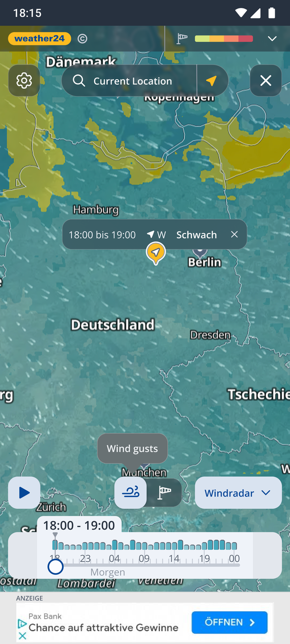
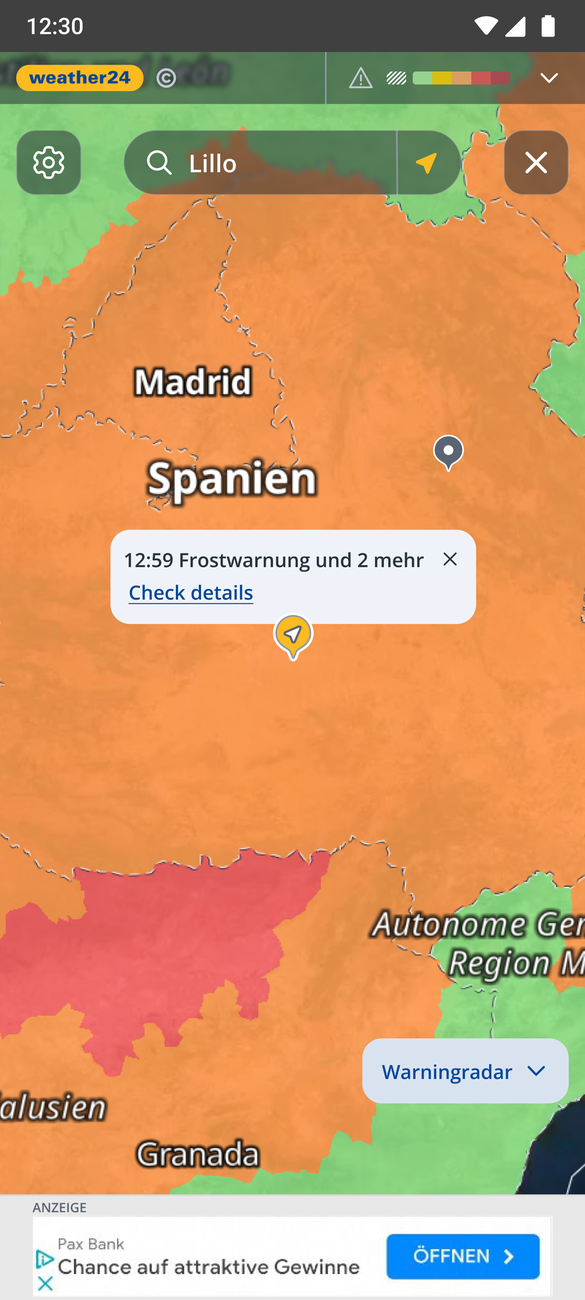
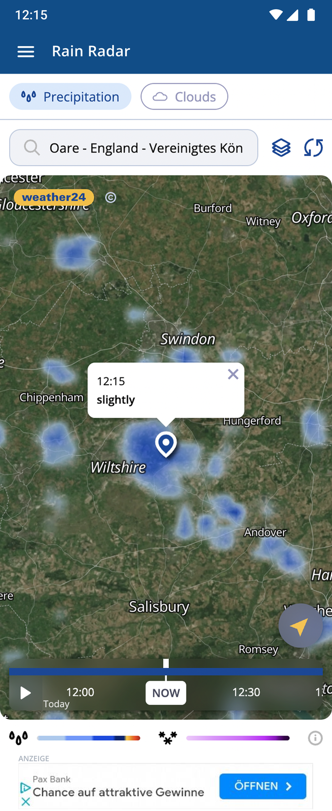
Later we made it easy to switch between products — the rain radar, the wind map and the weather-warnings map — and added a clouds on/off toggle on the rain radar. I redesigned those companion maps too, so the whole set shares one consistent, accessible visual language rather than three separate looks.

One panel to switch maps
Today's details panel — one place to jump into the Warnings, Wind and Cloud radars
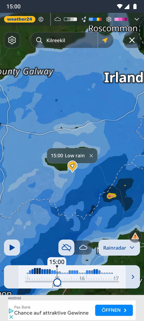
Rain radar
Rain radar — precipitation over Ireland with the cloud toggle and timeline
Wind radar
Wind radar — wind gusts over Germany with direction streaks
Warning radar
Warning radar — colour-coded weather warnings over Spain
The solution I'm proudest of

One arrow instead of a data-model explanation

Under the hood the radar stitches two data models — 5-minute real station data for the first couple of hours, then an hourly forecast. The seam between them never lands on a round time, so there's a gap. Competitors hit the same wall; none had solved it elegantly. The old fix was a grey screen announcing "switching to hourly forecast" — jarring, and it made users feel something was broken.

One screen-width window · tap → for the next range · tap ← to go back

So I stopped explaining and simplified radically. I spread the first two hours of 5-minute steps across the full screen width, so the whole window is visible at once, and added a plain right arrow to advance to the next range — the hourly forecast, spread the same way — and a left arrow to go back. No hidden scroll, no grey "switching models" screen, no ambiguity about which day you're on. People shouldn't have to know which model is running; they just need to reach their goal — look at a time range, tap → or ←. It solved the scroll problem, the day-navigation problem and the model-gap problem in a single, obvious control. (Shaped together with our Chief Product Officer.)

04

Outcome

A dense, real-time product that now reads at a glance — honest, accessible, and map-first.

What changed
  • Accessible by design — intensity reads by color, bar height and text, never color alone.
  • Trust restored — map and timeline show the same, honest data with no misleading gradients.
  • Map-first layout — full-screen map with translucent, accessible controls.
  • A timeline anyone can use — a bar chart plus ← → navigation, no hidden scroll, no jargon.
How it was built

A continuous, iterative process — research, design, ship, test, gather feedback, refine — still running today, roughly 3.5 years on. Many decisions were validated in usability testing and shaped with product and engineering, since rendering and data intervals were as much a technical question as a design one.

I led the research, data-visualization and interaction decisions; the final full-screen interface was built in collaboration with another designer.

+15%
User satisfaction score
+5%
Rainradar visits
Swipe or ← → to browse · click to zoom · Esc to close