Project · UX Research & Product Design

Helping millions find the
weather features they need

Evolving wetter.com's website and apps — a high-traffic product carrying 30+ features and a lot of legacy — toward a calmer, research-led experience that surfaces the right feature at the right moment without adding noise.

Client
wetter.com
Role
Senior UX/UI Designer
Platforms
Website · iOS · Android
Methods
Deep interviews · IA · Concept design · AI-assisted
Status
Shipped incrementally · home concept validated
UX Research Information architecture Feature discovery AI-assisted UX Accessibility Design system
Before
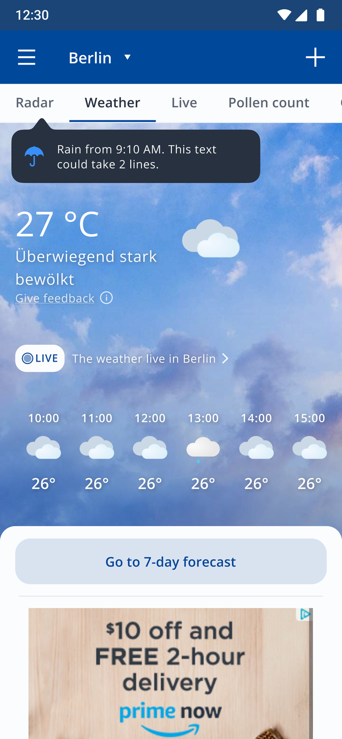
Old wetter.com Android home — dense weather tab with an intrusive ad
After · concept
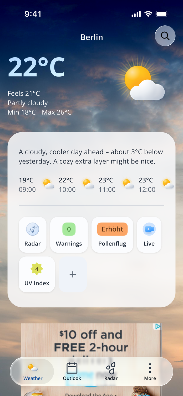
Redesigned home concept — feels-like, a friendly plain-language summary and glanceable feature cards
01

Overview

wetter.com's website and two mobile apps carry more than 30 genuinely useful features — pollen forecast, sunrise & sunset, vacation weather, garden and grill weather, UV index and many more — but most people never find them. At the same time, the screens risked overwhelming users with data they didn't ask for.

Because these are high-traffic products with millions of users, nothing ships as a big-bang redesign — a sudden change invites complaints, so we evolve step by step, measuring as we go, building every new page in the new design system (and modernizing the tech underneath: Material 2 → Material 3, the site moving to React). My focus: make the product calmer and the right features discoverable at the right moment. Parts have shipped incrementally. The home-screen redesign shown here is a personal concept I’m exploring — it’s still evolving, and the shipped version will differ.

02

The problem

Several problems at once — powerful features nobody could find, and screens that already felt overwhelming to read.

30+ useful tools sat buried in menus — and you can't promote them all at once (too many, and many are seasonal: UV and ski in summer, pollen in spring). Meanwhile the screens people did see felt cluttered: dense data they hadn't asked for, bright unremovable ads competing with content, and accessibility gaps that made the noise harder still. Discoverability, overload, visual noise and accessibility were all part of the same problem.

What we were up against
  • Hidden features — 30+ useful tools buried in menus, rarely used, often unknown.
  • Too much to promote — can't surface everything; much of it is seasonal.
  • Information overload — users called the packed screens "too much, unpleasant to read."
  • Visual noise around ads — bright, unremovable advertising competing with content.
  • Accessibility gaps — contrast, hierarchy and labelling that didn't hold up, making busy screens even harder to use.
  • Legacy weight — old code where fixing one thing quietly breaks another.
03

Process & decisions

3.1

Start with how people actually use weather

Before redesigning anything structural, I ran a series of deep, open-ended interviews across ages, life stages and geographies — exploratory research that reveals how people really behave, not what they think they should say. No rigid script: a warm-up, then concrete, experience-based questions to get past polished answers to real behaviour. I used AI to help synthesise the transcripts — clustering recurring patterns and surfacing themes faster — then validated every finding myself.

The core insight: people don't want weather for its own sake — they want it to plan. Two scenarios dominate — a frequent daily check, and an occasional, more deliberate one for a weekend or trip. Everything else (wind, humidity) is secondary: available, but never in the way.

Frequent · daily

Plan today

What to wear, getting the kids to school — it comes down to temperature and whether it'll rain. Often checked on a watch, widget or smart speaker.

TemperatureRain?Glanceable
Occasional · planning

Plan a weekend or trip

Comparing several days ahead for a getaway or event — people weigh a range of days, not a single moment.

Multi-dayCompareDeliberate
Deep interviews · design-thinking AI transcription AI theme clustering Validated by me
"When did you last check the weather?" — I ask about a real, recent moment, not what people usually do. That keeps them from reaching for the polished, idealised answer and surfaces how they actually behave.Deep interviews · design-thinking method · across ages, life stages & geographies
Real, recent moments — not what people usually do — surfaced how they actually behave. A few voices:

“I never open the daily view — a huge, endless table, like a portal to hell. Air pressure in hPa? Who even looks at that?”

Parent of two · checks the weather daily

“If I see a little sun, that’s it — I don’t even read the temperature. A cloud and I’m already down; rain and I just know I need to prepare.”

Everyday morning-checker

“I love ‘feels like’ — that feels like the real temperature, not the number the sensors show in the shade.”

Cyclist · dresses by feel

“When we head out I always check the wind — without a ‘feels-like’ I have to. If it’s windy she needs a warmer layer, and her hands freeze, so on go the mittens.”

Parent · dresses a small child

“I wake up and the widget already shows what the day holds — I don’t open anything. But planning a trip, I compare every site, tab by tab.”

Widget user & trip planner

“The ideal? Look through the window and see not a number but how it feels — ‘cozy’, or ‘perfect for a run’.”

Wants weather in plain words

3.2

A home screen that plans with you

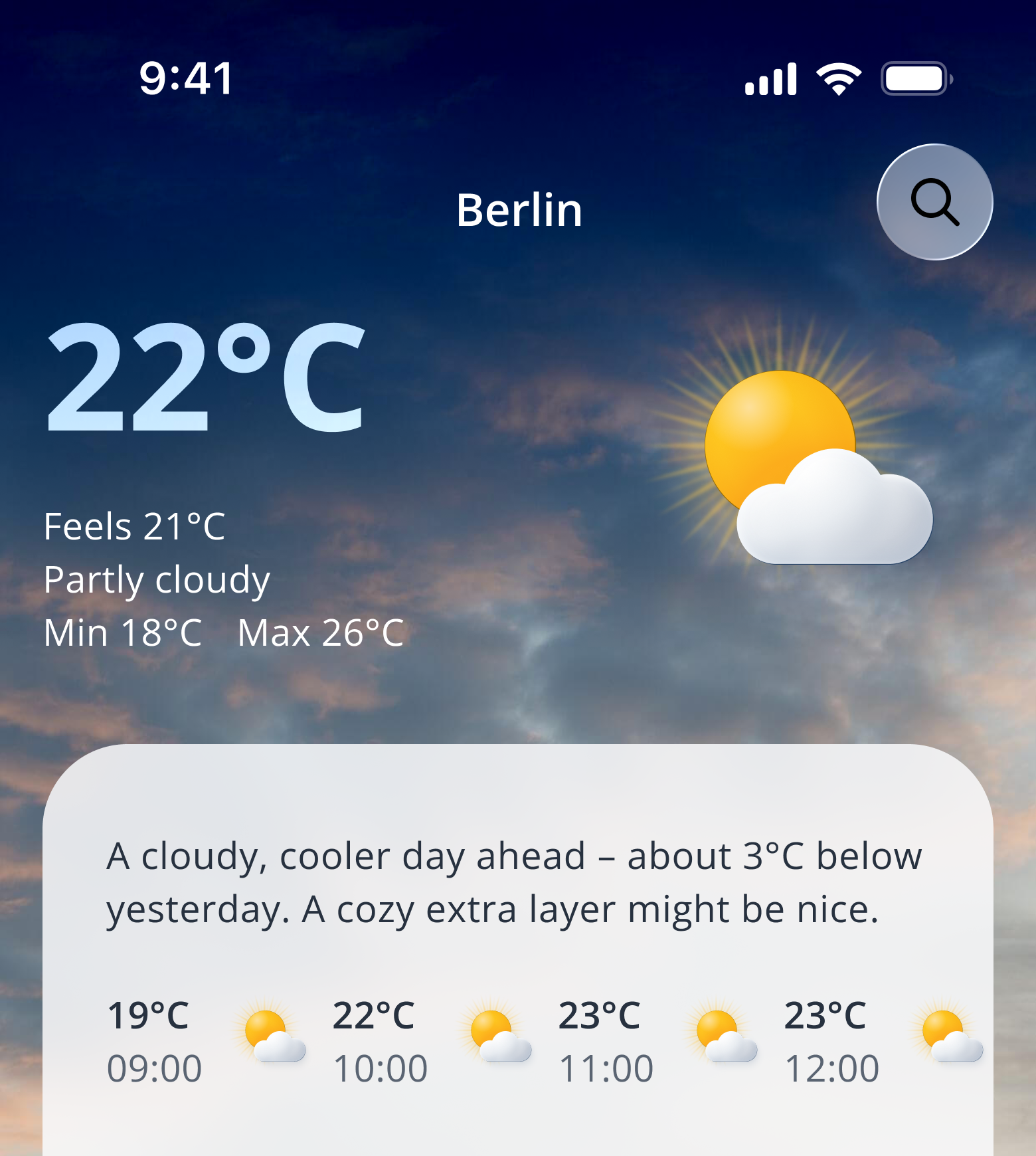
The redesigned home leads with current and today's weather — high/low and feels-like temperature. Feels-like matters more than it looks: one father dressing his three-year-old was reading wind and humidity himself to decide on mittens; feels-like folds all of that into a single perceived temperature, so nobody has to hunt. Alongside it, a plain-language description that's warm and anticipatory — "colder by noon, grab a layer" — caring, never pushy (no directive pressure), and refreshed through the day as conditions change. The friendly text is generated with AI, in the user's context.

Redesigned home — current and today's weather with feels-like temperature and a warm, plain-language summary that refreshes through the day
3.3

Glanceable cards that double as feature entry points

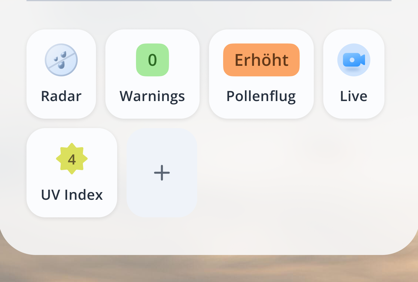
Under the main weather sit small info cards — rain and warnings — readable without reading: the rain card glows blue when rain is coming and stays calm when it isn't; the warnings card shows a warning color or stays green for all-clear. They're tappable and open the right product — rain into the radar, warnings into the warnings map. Seasonal, contextual cards join when relevant — a UV-index card showing the current level with a plain label, a pollen card flagging an elevated count — always unobtrusive. Each one serves the user's goal and quietly drives discovery of a feature at the same time.

Glanceable feature cards — Radar, Warnings (green all-clear), Pollenflug (elevated) and Live, plus a UV index card and an add-card control
3.4

Helping people find the right feature at the right moment

Rather than one overwhelming feature dump, I designed a reusable section — "Heute relevant in [city]" (with a new badge, because "Features" means nothing to a user) — that leads with three large promoted tiles (seasonal and contextual) above the full grid of all ~30 features, which fades after the first row behind a "show all" control, plus feature search on mobile. Promoted features also remain in the full list, and positions never shift — so people can always re-find what they saw (a principle I share with our CPO). Beyond that, bigger feed-style feature cards can be dropped onto any page where they're contextually relevant, so promotion follows relevance instead of living in one fixed spot — and in the new concept, people can customize which features they see (some, like warnings, stay fixed).

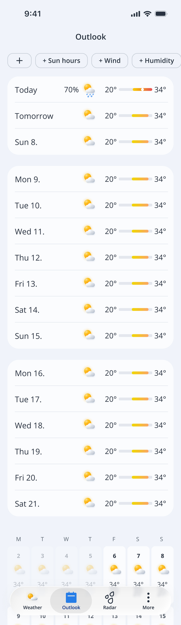
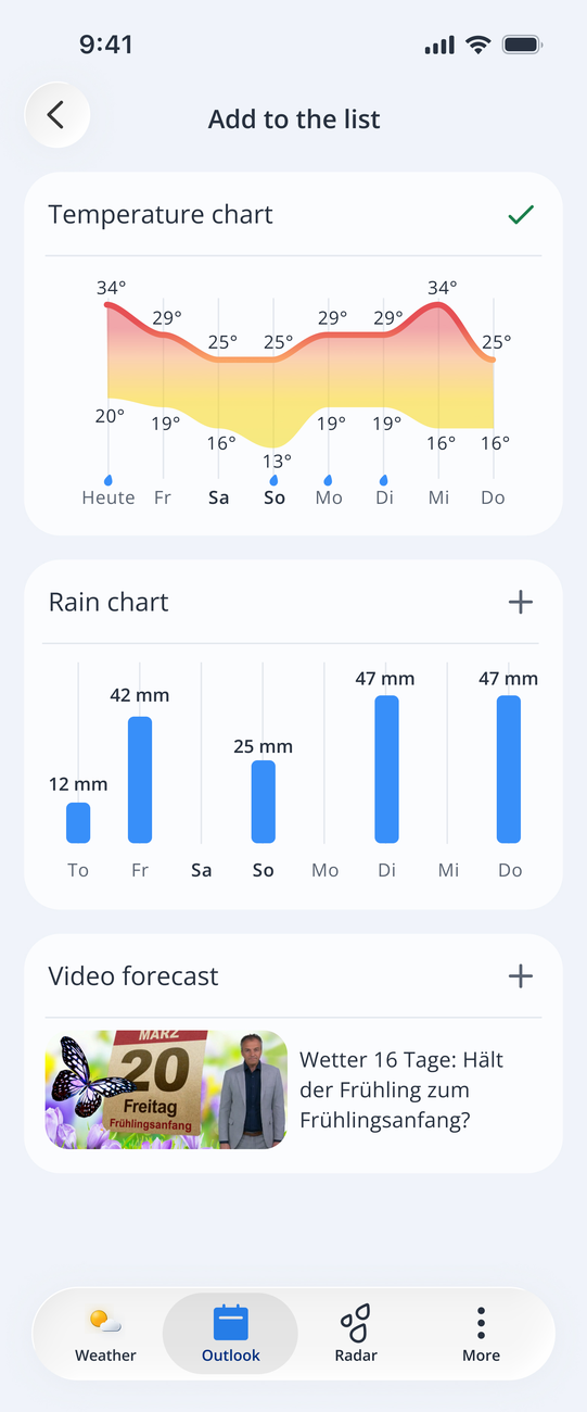
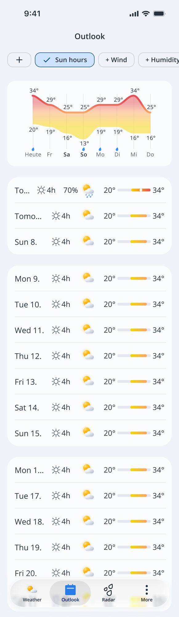
Customization — the comparison list stays calm by default; tap + to pull any parameter (wind, sun hours…) inline across every day. Quick to compare without overloading — exactly the occasional trip-planning scenario.
Default · clean list
Outlook — the clean multi-day comparison list, no extra detail by default
Tap + to add a widget
Add screen — tap the plus to add a chart or column, such as a temperature chart or sun hours
Added · compare inline
Outlook with a temperature chart and sun hours now shown inline for every day
3.5

App icon, re-crafted for a new era

The icon was a flat raster image — a gradient sun with rays. I rebuilt it fully in vector and, when iOS introduced Liquid Glass icons, remade it as layers in Apple's Icon Composer (and did the same for Android), handing the file to engineering. The mark has no single glyph — a rayed sun behind clouds, full of gradients — yet it had to hold up across every new mode: clear glass, tinted (any single user colour), colourless, and Dark Mode. Dark mode was the hardest — a sun and clouds read oddly at night — so after many iterations I moved it into sunset tones that keep the brand instantly recognisable. Modern, still unmistakable, and with no drop in App Store performance.

BeforeFlat raster · fixed gradients
Old wetter.com app icon — flat raster sun and clouds
AfterRebuilt in vector · layered
New wetter.com app icon — rebuilt in vector, layered
Icon background base layer
Sun rays layer
Sun body layer
Back cloud layer
Middle cloud layer
Front cloud layer
Hover to expand the stack
  1. Front cloud
  2. Middle cloud
  3. Back cloud
  4. Sun
  5. Rays
  6. Background
App icon adapted across modes — default, dark, clear glass and tinted
The insight that reframed everything

Weather is for planning — not for reading

The interviews reframed the whole product. Nobody opens a weather app to admire data; they open it to make a decision — what to wear, whether to bike or drive, how to dress the kids, whether the weekend is worth a trip. That single shift decided what leads (temperature, rain, feels-like), what supports (glanceable warnings and seasonal cards), and what steps politely aside (wind, humidity, and the long tail of features) until the moment it's relevant.

Scenario 1 · everyday

"Plan my day." Temperature and rain, read in seconds — often from a watch, widget or smart speaker. This is what the home screen is built around.

Scenario 2 · occasional

"Plan my weekend or trip." A multi-day overview to compare days — surfaced when wanted, not forced onto everyone all the time.

04

Shipped along the way

Smaller, concrete improvements delivered incrementally in the new design system:

Radar on city pages

A section under today's weather showing next-2-hour precipitation as a bar chart, linking straight into the radar — "Regenradar Berlin", "Regenradar Rom" — surfacing what research showed people care about most: will it rain.

Editorial redesign

Rebuilt the article and daily weather-video pages (produced by the in-house Munich media team) on the new typography and color — calmer, more readable, on-system.

Newsletter banner

Replaced an outdated animated radar banner in the ad column with an on-brand newsletter promo — logo included so readers know it's our content, not an ad.

First "Heute relevant" section

Shipped the initial feature-visibility section on desktop and mobile web, with feature search on mobile — the first step of the wider concept.

Content, separated from ads

Gave ad blocks a distinct grey-blue background and kept the surrounding content calm and functional — so our content reads as trustworthy and visually distinct from unremovable advertising.

05

Outcome

A high-traffic product moving, step by step, from noisy and buried to calm and discoverable.

What changed
  • Content reads calmer — functional color and clear separation from advertising.
  • Right feature, right moment — contextual cards and a reusable discovery section.
  • Research-led home — built around planning, with feels-like and friendly, AI-assisted guidance.
  • Everything on-system — new pages ship in the new design system as the product evolves.
  • AI in the workflow — used AI to speed up research synthesis and to generate contextual, on-brand guidance copy.
How it was built

A deliberately incremental approach for a product with millions of users and heavy legacy — ship small, measure, and migrate users gradually rather than forcing a big-bang redesign. The home-screen redesign is a research-validated concept, aligned with product and fellow designers, not yet in code.

Swipe or ← → to browse · click to zoom · Esc to close